Page 1 of 1[ 3 posts ]
My first attempt at fanart. xD


wilddrawfour.tumblr.com
Gender: Male
Location: Yes
Rank: Medium-in-training
Joined: Thu Aug 14, 2008 12:19 pm
Posts: 457
This was supposed to be my Crossover Contest entry, but alas, High school got the better of me and my time.
Spoiler:
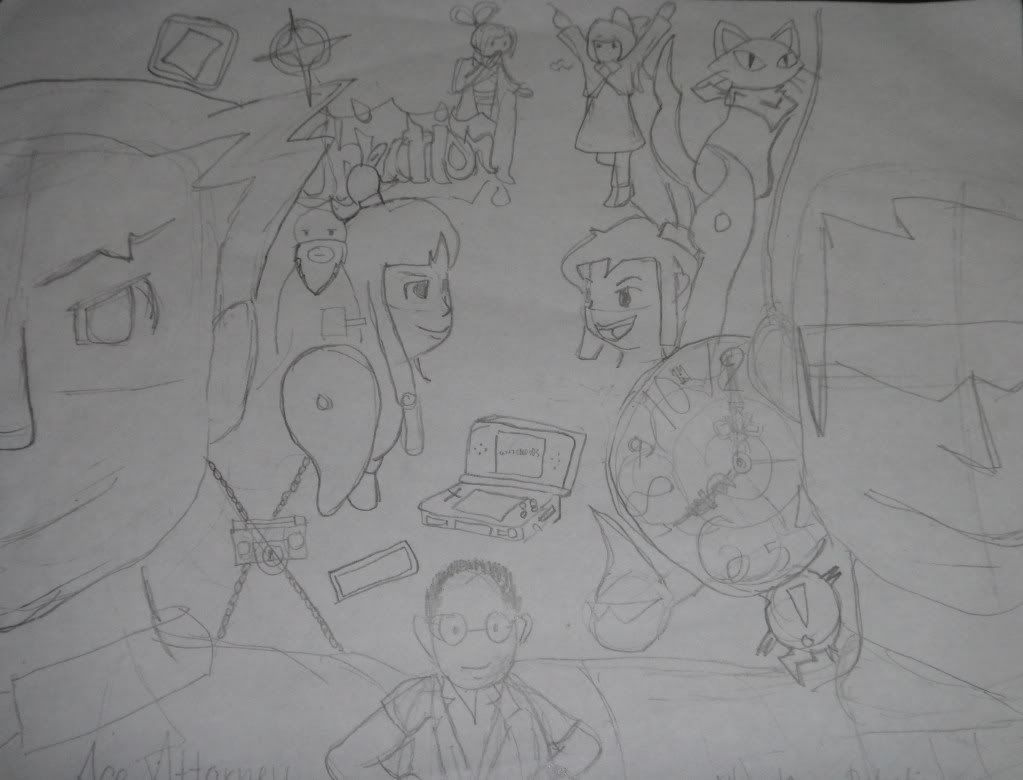
It's barely even half-done. Comments? Suggestions?

HERE COME DAT SPIRIT MEDIUM!
Re: My first attempt at fanart. xD

Waiting on Godot...
Gender: Female
Location: New Zealand
Rank: Ace Attorney
Joined: Mon Jul 21, 2008 9:23 am
Posts: 2404
It's not an easy layout to accomplish, so perhaps you should take some elements out and make each object / person have more or less say as a presence rather than as a collage. Your dude in the foreground, if he's the maker, I'd put him ominous in the background like he's a god pulling the strings (For example, this was meant to be intimadating, but a non intimadating version of this is what I mean), mabe have Lynne and Maya running towards the viewer with their legs almost touching, Maybe Kamila and Pearls doing something cute in the background with Missile x2. In the background have the magatama all ominous and chains with the clock on the otherside and spirit Sissel and the cat roaming about. This is how I'd lay it out though. Any way works as long as it has an aesthetic. I think this is where you were going with it. You have alot of concepts on the page fighting for attention, and Only Phoenix and Sissel stand out cause they're the only ones changed in size for perspective.
I hope this helped!


Re: My first attempt at fanart. xD
Fancy a cuppa?
Gender: Female
Location: UK, unless I'm in France.
Rank: Medium-in-training
Joined: Fri May 01, 2009 7:16 pm
Posts: 338
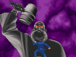
^Click for link!
Page 1 of 1
[ 3 posts ]
Who is online
Users browsing this forum: No registered users and 1 guest
You cannot post new topics in this forum
You cannot reply to topics in this forum
You cannot edit your posts in this forum
You cannot delete your posts in this forum
You cannot post attachments in this forum
You cannot reply to topics in this forum
You cannot edit your posts in this forum
You cannot delete your posts in this forum
You cannot post attachments in this forum
