
What do you see behind the mask?
Gender: Female
Location: Germany
Rank: Ace Attorney
Joined: Thu Mar 13, 2008 11:09 pm
Posts: 2431

Gender: Female
Location: England
Rank: Ace Attorney
Joined: Sun Jul 27, 2008 4:02 pm
Posts: 1955
Can't wait to see moar ~
^ Click for my graphics ^

Ralvor?
Gender: Male
Location: Germany
Rank: Desk Jockey
Joined: Fri Jul 11, 2008 11:25 pm
Posts: 80
Good work you're doing there! Could it be that you like the fluid metal or whatever background? :D And I have suggestion to you :) Since I'm not sure which programme you use, I'll just guess it is photoshop - the only one I know besides paint XD I wanted to suggest, that you try to get the characters a little bit more into the picture. Maybing adding a layer above them and then play a little bit with the brushes and filters. It might look even better then now! Give it a try - I'll check out later :D
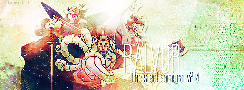
Thanks to Vickinator for creating this awesome signature and avatar for me! Link to her thread: Click on my signature!

Quote of the Year 2008!
Last edited by Ralvor on Fri Jan 09, 2009 11:40 pm, edited 1 time in total.


Moving on up!
Gender: Female
Location: USA
Rank: Donor
Joined: Wed Jul 02, 2008 3:22 pm
Posts: 5333
Good work you're doing there! Could it be that you like the glibberish background? :D And I have suggestion to you :) Since I'm not sure which programme you use, I'll just guess it is photoshop - the only one I know besides paint XD I wanted to suggest, that you try to get the characters a little bit more into the picture. Maybing adding a layer above them and then play a little bit with the brushes and filters. It might look even better then now! Give it a try - I'll check out later :D
Glibberish background? I assume you mean on the avatars, and yes, making that effect was fun but I'm going to try others.
I am using Photoshop. Do you mean putting more effects in a layer above the characters?
Thanks for the advice, and when I have some more time I'll try come up with something new from everyone's suggestions.

Thanks to Blinq for the awesome sig. Click the sig, see my stuff.
Edgeworth/Maya Community. A friends, as lovers, as part of OT3s. All Welcome.
"Yeah, I wouldn't go asking random guys if you can lick their penor." crouton December 2009
Ralvor?
Gender: Male
Location: Germany
Rank: Desk Jockey
Joined: Fri Jul 11, 2008 11:25 pm
Posts: 80
Sorry for my bad english XD
Thanks to Vickinator for creating this awesome signature and avatar for me! Link to her thread: Click on my signature!
Quote of the Year 2008!
Moving on up!
Gender: Female
Location: USA
Rank: Donor
Joined: Wed Jul 02, 2008 3:22 pm
Posts: 5333
Sorry for my bad english XD
Don't worry about your English; if something is unclear all I have to do is ask.
Fluid metal is a good description, but I've also seen the effect called water (when you make it blue at least).
Any ideas on what kind of filters or brushes would look good over the character art?
Thanks to Blinq for the awesome sig. Click the sig, see my stuff.
Edgeworth/Maya Community. A friends, as lovers, as part of OT3s. All Welcome.
"Yeah, I wouldn't go asking random guys if you can lick their penor." crouton December 2009


*scribble scribble*
Gender: Female
Location: In a cottage cheese cottage
Rank: Prosecutor
Joined: Sun Feb 24, 2008 11:31 pm
Posts: 709
a) Create a new layer
b) Filter>Render>Clouds. Make sure to press 'd' to restore colors to defaults.
c) Filter>Render>Difference Clouds
d) Repeat Difference Clouds until you like the cloud distribution.
e) Set layer blending mode to 'overlay'.
f) If some parts look too light or dark to you, use the burn/dodge tool (respectively) on the cloud layer. For instance, on the following screenshot, in the first one it wasn't burned, in the second it was (in the upper left corner).
e) If the darkness of the picture irks you, adjust brightness. I didn't bother because I personally liked it this way, but everybody has different preferences.
Looks like this.


Moving on up!
Gender: Female
Location: USA
Rank: Donor
Joined: Wed Jul 02, 2008 3:22 pm
Posts: 5333
a) Create a new layer
b) Filter>Render>Clouds. Make sure to press 'd' to restore colors to defaults.
c) Filter>Render>Difference Clouds
d) Repeat Difference Clouds until you like the cloud distribution.
e) Set layer blending mode to 'overlay'.
f) If some parts look too light or dark to you, use the burn/dodge tool (respectively) on the cloud layer. For instance, on the following screenshot, if I had half a brain I would have used the burn tool on the upper left corner. Unfortunately, I didn't and I don't want to retake the screenshot. But I tried it afterwards and it looked...uh...not as odd.
e) If the darkness of the picture irks you, adjust brightness.
Looks like this.
Thanks for the suggestion, biblio. I'll have to try that. With this kind of edit the art will look more like it's apart of the image instead of just sitting on top of it, which is another point I think Ravlor was making.
Thanks to Blinq for the awesome sig. Click the sig, see my stuff.
Edgeworth/Maya Community. A friends, as lovers, as part of OT3s. All Welcome.
"Yeah, I wouldn't go asking random guys if you can lick their penor." crouton December 2009
Ralvor?
Gender: Male
Location: Germany
Rank: Desk Jockey
Joined: Fri Jul 11, 2008 11:25 pm
Posts: 80
Yep, I'll do so :D
Ok here we go! I couldn't change much, but I tried some effects and this is the result:


*Phew* Finished. My first somewhat tutorial XD
Hope it'll help you ;)
Thanks to Vickinator for creating this awesome signature and avatar for me! Link to her thread: Click on my signature!
Quote of the Year 2008!
Moving on up!
Gender: Female
Location: USA
Rank: Donor
Joined: Wed Jul 02, 2008 3:22 pm
Posts: 5333
First Set:


Second Set:


I think it looks pretty cool on some of them, but on others it looks to dark. When I tried to use the Dodge tool to correct it, it made it look like there was no effect on the layer anymore. I think the first set looks better, but I thought I would share all of them just in case people liked these too.
Ravlor, I tried to follow your tutorial but mine didn't turn out like yours. What color did you use to paint on your new layer before you put effects on to it? Also, I was unclear what to do with the contour layer.
I still plan to try the Bas Relief and Chrome effects on my next experiments. My next project will be a new signature that I talked about making in another thread. I just have to collect all the art I want to use, clean it, and assemble it. When that's taken care of I'll worry about the backround.
Thanks to Blinq for the awesome sig. Click the sig, see my stuff.
Edgeworth/Maya Community. A friends, as lovers, as part of OT3s. All Welcome.
"Yeah, I wouldn't go asking random guys if you can lick their penor." crouton December 2009
*scribble scribble*
Gender: Female
Location: In a cottage cheese cottage
Rank: Prosecutor
Joined: Sun Feb 24, 2008 11:31 pm
Posts: 709

I'm excited to see the new signature, though!
Moving on up!
Gender: Female
Location: USA
Rank: Donor
Joined: Wed Jul 02, 2008 3:22 pm
Posts: 5333
I'm excited to see the new signature, though!
I really liked how the top Franziska turned out as well. I never even noticed the unintentional humor the Makoto one has until you pointed it out.
I'm conflicted on the new signature. I don't think I have enough space to include all the characters I want. Now I'm debating whether or not to make several different sigs with the same theme (Edgeworth and his conquests by case and game because just going by game would be too big as well).
Thanks to Blinq for the awesome sig. Click the sig, see my stuff.
Edgeworth/Maya Community. A friends, as lovers, as part of OT3s. All Welcome.
"Yeah, I wouldn't go asking random guys if you can lick their penor." crouton December 2009
Gender: Female
Location: England
Rank: Ace Attorney
Joined: Sun Jul 27, 2008 4:02 pm
Posts: 1955
^ Click for my graphics ^
Moving on up!
Gender: Female
Location: USA
Rank: Donor
Joined: Wed Jul 02, 2008 3:22 pm
Posts: 5333
Thanks. I need to change my avatar to one of these edited ones.
Thanks to Blinq for the awesome sig. Click the sig, see my stuff.
Edgeworth/Maya Community. A friends, as lovers, as part of OT3s. All Welcome.
"Yeah, I wouldn't go asking random guys if you can lick their penor." crouton December 2009

freelance graphic designer
Gender: Female
Location: New York.
Rank: Ace Attorney
Joined: Wed Feb 28, 2007 11:41 pm
Posts: 1103
I'm glad to see that Biblio offered some good advice on how to blend the images into the background some more. Looks like you're improving at a good pace!
I also agree with you that some of them are too dark... it's a fine line, sometimes. There often needs to be individual adjustments with the contrast and levels before the result is at a good balance between light/dark.
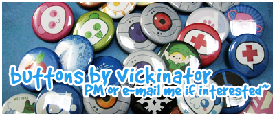
http://vickinator.deviantart.com/
http://www.vickinator.etsy.com
Selling 1 1/4" pinback buttons~ Please PM me if interested.
Moving on up!
Gender: Female
Location: USA
Rank: Donor
Joined: Wed Jul 02, 2008 3:22 pm
Posts: 5333
I'm glad to see that Biblio offered some good advice on how to blend the images into the background some more. Looks like you're improving at a good pace!
I also agree with you that some of them are too dark... it's a fine line, sometimes. There often needs to be individual adjustments with the contrast and levels before the result is at a good balance between light/dark.
I'm honored that you have come to look at my thread, and yes, Biblio had been a great help in improving my graphics. I'm still learning all the ins and outs of Photoshop, so could please point out how I can adjust the contrast levels? I would assume this would occur on the individual layers.
I guess I can go ahead and post this work in progress for the new signature. I did the clouds/difference clouds for the background, then copied it and then changed the hue on the bottom layer and overalyed the duplicate. I then used the Water Paper render on the overlayed layer. I duplicated this and overlayed it on top of the character images to try to blend them, but it looked to harsh so I adjusted the opacity and fill to 64%/35% respectively. I'm not sure if I should try any more adjustments to make the character's blend in better with the background. Any thoughts?

Thanks to Blinq for the awesome sig. Click the sig, see my stuff.
Edgeworth/Maya Community. A friends, as lovers, as part of OT3s. All Welcome.
"Yeah, I wouldn't go asking random guys if you can lick their penor." crouton December 2009
*scribble scribble*
Gender: Female
Location: In a cottage cheese cottage
Rank: Prosecutor
Joined: Sun Feb 24, 2008 11:31 pm
Posts: 709
I screenied the end result
 (minus the top text >>) If you want me to tell you exactly how I got there, I will. Otherwise, just generally try making layers with effects on them, like clouds or fiber, then erase the layer over their faces. Making the bottom darker helped a bit.
 Also, if you want no darkness and a general blending effect try duplicating the layer, doing a Gaussian Blur of around 5-8 pixels (I did 7.5), set it on overlay (You can experiment with others as well--I found that Linear Light worked fine), and again use a default brush size 100 or so that fades out around the edges to erase the blurry layer around their faces. (Make sure to erase! Otherwise the details of their faces will look icky.) Doing the Gaussian Blur should soften the characters so that they blend in a bit better.
Screenie of sig with just the blur effect:

I hope that helps! And I'm sorry if I'm being confusing

Moving on up!
Gender: Female
Location: USA
Rank: Donor
Joined: Wed Jul 02, 2008 3:22 pm
Posts: 5333
Screenie of sig with just the blur effect:
I hope that helps! And I'm sorry if I'm being confusing
In my sig, which layer would I duplicate and edit? I have the following layers:
Clouds/Difference Clouds with a red hue
Clouds/Difference Clouds with the Water Paper Render
Character Art (Seperate by character in another image if I need readjust them)
Duplicate of Layer 2 with the opacity and fill set at lower than 100%
Thanks for your help. I'm not sure if I should scrap the background entirely. It just seems weird to me, but I'm not sure what kind of background will fit better.
Thanks to Blinq for the awesome sig. Click the sig, see my stuff.
Edgeworth/Maya Community. A friends, as lovers, as part of OT3s. All Welcome.
"Yeah, I wouldn't go asking random guys if you can lick their penor." crouton December 2009
*scribble scribble*
Gender: Female
Location: In a cottage cheese cottage
Rank: Prosecutor
Joined: Sun Feb 24, 2008 11:31 pm
Posts: 709
 Uhmmm...to replicate the effect, I suppose you could duplicate all of the layers and apply the Gaussian blur on them.
 The background seems fine to me, but if you really think it doesn't fit than you can just experiment with some more effects...
Oh, I forgot. Another way to blend the characters... you can also try using some brushes on a new layer on top of the characters and see which blending mode keeps the brush from being unobtrusive but still unifying (splatters, swirls, something like that.) I don't know if you like using brushes though
Moving on up!
Gender: Female
Location: USA
Rank: Donor
Joined: Wed Jul 02, 2008 3:22 pm
Posts: 5333
Uhmmm...to replicate the effect, I suppose you could duplicate all of the layers and apply the Gaussian blur on them. The background seems fine to me, but if you really think it doesn't fit than you can just experiment with some more effects...
Oh, I forgot. Another way to blend the characters... you can also try using some brushes on a new layer on top of the characters and see which blending mode keeps the brush from being unobtrusive but still unifying (splatters, swirls, something like that.) I don't know if you like using brushes though
I haven't used brushes before in this manner, but I'm willing to experiment with different methods to see what I like best. Do you know how to make custom brushes?
I'll keep working with the image until I'm satisfied. I'm used to making simple backgrounds, so I guess I'm just nervous that a more complex one will end up looking ridiculous.
Thanks to Blinq for the awesome sig. Click the sig, see my stuff.
Edgeworth/Maya Community. A friends, as lovers, as part of OT3s. All Welcome.
"Yeah, I wouldn't go asking random guys if you can lick their penor." crouton December 2009
*scribble scribble*
Gender: Female
Location: In a cottage cheese cottage
Rank: Prosecutor
Joined: Sun Feb 24, 2008 11:31 pm
Posts: 709
I'll keep working with the image until I'm satisfied. I'm used to making simple backgrounds, so I guess I'm just nervous that a more complex one will end up looking ridiculous.
I know how in the sense that I could, say, take a picture and make it into a brush. I don't know how in the sense that I probably couldn't, say, make a vector brush.
I'm sure it wouldn't, but there is merit in making background with effects only--those who can do it well are truly amazing. ^^ You can go either route. If you do want to use brushes, though, I could either refer you to some brushes places or tell you how to make brushes yourself (I hope it doesn't differ from PS to PSE...)
freelance graphic designer
Gender: Female
Location: New York.
Rank: Ace Attorney
Joined: Wed Feb 28, 2007 11:41 pm
Posts: 1103
It COULD occur on an individual layer, but as a whole, you can easily lighten the whole thing by going to..
(There's several ways to get to this function, I'm just mentioning one.)
Layer --> Adjustment Layer --> Levels (Move the arrows and it will make the result lighter or darker, with a noticable effect on contrast.)
If you want to adjust brightness/contrast, select Layer --> Adjustment Layer --> Brightness/Contrast.
Curves (same method to get to it as the others) is also good. It can be very nitpicky though.. to use it, simply change the curve. If you click the dot in the middle of the curve and move it upwards, it will make it lighter. The opposite will make it darker. This feature is more versatile than the others because you can basically mess around with the curve. Most results out of this will be from trial and error.
Your question about brushes:
It's as easy as opening a document or image and then going to edit --> "define brush."
However, making custom brushes, of course, requires much more work. Anyone can take an image (for example, a drawing) from someone else and claim it as their brush >:|
I make my own brushes (I draw them or edit them with random shapes and stuff) and have had a bunch of brush sets uploaded to dA in the past. I changed my account though so they're not available at the moment. T__T
Anyway, I think it's admirable that you stick to defaults only (which means no brushes, no outside resources). This is a great way to master what Photoshop can do. :B
"I'm used to making simple backgrounds, so I guess I'm just nervous that a more complex one will end up looking ridiculous."
Nothing wrong with simple backgrounds.
---
I tried applying some defaults to your WIP and I know how to use clouds so that it looks more blended. Of course it's not perfect, but it's a good start.
First, I never used this technique before but I used Biblio's original suggestion of using a clouds/difference clouds layer and then moving on from there.. to keep things simple and to not stretch you in like ten thousand different directions.
1. Make a new clouds layer on top of your document (render clouds)
2. Difference clouds
3. Adjust the layer's levels (CTRL+L), make it so that the lines in between the cloud shapes are not as visible
4. Duplicate the cloud layer IF NECESSARY (should do it if the puffy clouds are not as visible)
5. Set these layers to SCREEN. This will make it seem like you put the clouds on top of your document.
6. If the clouds' locations are in the characters' faces, simply erase and edit the layer(s). It's all about editing.
6. You can then adjust hue/saturation as you see fit.
Note: It's better to colorize the background once you're sure that any effects on top of the images are for the most part, set in place. Notice how you need to adjust the color of the mist/clouds separately from the background... otherwise, you're basically recoloring the background and this can easily lead to contrast problems later on, depending on how you colorize.
http://vickinator.deviantart.com/
http://www.vickinator.etsy.com
Selling 1 1/4" pinback buttons~ Please PM me if interested.
Ralvor?
Gender: Male
Location: Germany
Rank: Desk Jockey
Joined: Fri Jul 11, 2008 11:25 pm
Posts: 80
http://www.veoh.com/videos/v17177337MtZN6dTm
Shame on me for talking like a doctor XD I'll hope this will clear our misunderstandings and doesn't create new because of my spelling and pronounciation.
The resolution is fucked up because of veoh, so if you want it in a better quality pm me your e-mail adress. I might send you a virus as well :D
Thanks to Vickinator for creating this awesome signature and avatar for me! Link to her thread: Click on my signature!
Quote of the Year 2008!
Moving on up!
Gender: Female
Location: USA
Rank: Donor
Joined: Wed Jul 02, 2008 3:22 pm
Posts: 5333
http://www.veoh.com/videos/v17177337MtZN6dTm
Shame on me for talking like a doctor XD I'll hope this will clear our misunderstandings and doesn't create new because of my spelling and pronounciation.
The resolution is fucked up because of veoh, so if you want it in a better quality pm me your e-mail adress. I might send you a virus as well :D
Thank you for making a video tutorial, Ralvor. You have gone above and beyond what is necessary in order to help me. If there is anything I can ever do for you, please let me know I can do my best. I think I understand what do to now, and when I have some more time I will try out the techniques again.
Thanks for all of your help as well, Vicki. I have a lot to work on based on everyone's suggestions today, but it will be worth it.
Thanks to Blinq for the awesome sig. Click the sig, see my stuff.
Edgeworth/Maya Community. A friends, as lovers, as part of OT3s. All Welcome.
"Yeah, I wouldn't go asking random guys if you can lick their penor." crouton December 2009
What do you see behind the mask?
Gender: Female
Location: Germany
Rank: Ace Attorney
Joined: Thu Mar 13, 2008 11:09 pm
Posts: 2431
The only critique I have is that Gumshoe merges too much with the background, I'd say. That's bugging me a bit.
Besides that, awesome work!
Moving on up!
Gender: Female
Location: USA
Rank: Donor
Joined: Wed Jul 02, 2008 3:22 pm
Posts: 5333
The only critique I have is that Gumshoe merges too much with the background, I'd say. That's bugging me a bit.
Besides that, awesome work!
Gumshoe has been giving me problems as well. His original backround is so dark that the new effects only made it darker. I lightened it up with the Dogde tool, but it still blends in a bit like you pointed out.
Thanks to Blinq for the awesome sig. Click the sig, see my stuff.
Edgeworth/Maya Community. A friends, as lovers, as part of OT3s. All Welcome.
"Yeah, I wouldn't go asking random guys if you can lick their penor." crouton December 2009
Moving on up!
Gender: Female
Location: USA
Rank: Donor
Joined: Wed Jul 02, 2008 3:22 pm
Posts: 5333

This one has two layers of difference clouds. One over the background and one over the charaters. I set the one of the characters to an opacity of 50%.

I used the Liquify filter to make this look like curtains and then set the hue to make it look red. I have another layer that I can use as overlay on this, but it only makes the charaters and background look brighter.
Any critique on either of these attempts is appreciated.
Thanks to Blinq for the awesome sig. Click the sig, see my stuff.
Edgeworth/Maya Community. A friends, as lovers, as part of OT3s. All Welcome.
"Yeah, I wouldn't go asking random guys if you can lick their penor." crouton December 2009
Ralvor?
Gender: Male
Location: Germany
Rank: Desk Jockey
Joined: Fri Jul 11, 2008 11:25 pm
Posts: 80
Ralvor#s here to bother you again ;) So you need constructive critique. Let me try to help you :) What I personally noticed first is that all the characters have "different" colours. I don't mean the colours itself but the "white" effect on them. So what I would recommend you is to use the shortcut ctrl+l and then change it. You need to move the black coursor to the right side. If you want a brighter touch you have to move the white coursor to the left. Try it it might look better than before ;P
The next critiscm I have for you goes to the first signature. Even though the background itself looks good, I personally think that it is a little bit to white. You should try to add some flashy colours as well. But I think it is a matter of taste :D
And now to my last critiscm for today the font :D You could actually use a font which looks more interesting and add some filling options to it as well :D That would increase the overall image ;) If you would do so the font would look like it belongs to the signature and isn't just placed on top.
But all in all we have a great development here!
PS: There is a tricky thing in photoshop as well which is callled layer mask! It's a must know! Here's simple tutorial I found on google: http://photoshoptips.net/2006/07/25/layer-masks/
Thanks to Vickinator for creating this awesome signature and avatar for me! Link to her thread: Click on my signature!
Quote of the Year 2008!
Moving on up!
Gender: Female
Location: USA
Rank: Donor
Joined: Wed Jul 02, 2008 3:22 pm
Posts: 5333
Ralvor#s here to bother you again ;) So you need constructive critique. Let me try to help you :) What I personally noticed first is that all the characters have "different" colours. I don't mean the colours itself but the "white" effect on them. So what I would recommend you is to use the shortcut ctrl+l and then change it. You need to move the black coursor to the right side. If you want a brighter touch you have to move the white coursor to the left. Try it it might look better than before ;P
So what you're saying is to change the color balance on the individual characters so that they match and are more uniform?
I agree with this, and the effect looks too cloudy to me.
I need to download more fonts, so this will be a good opportunity to play with different styles.
PS: There is a tricky thing in photoshop as well which is callled layer mask! It's a must know! Here's simple tutorial I found on google: http://photoshoptips.net/2006/07/25/layer-masks/
Thank you for your critiques and for the tutorial. I just found out that the school I work for has photoshop tutorials available on a new program they are implementing. When I get home I'll have check this out and work on my graphics more.
Thanks to Blinq for the awesome sig. Click the sig, see my stuff.
Edgeworth/Maya Community. A friends, as lovers, as part of OT3s. All Welcome.
"Yeah, I wouldn't go asking random guys if you can lick their penor." crouton December 2009
freelance graphic designer
Gender: Female
Location: New York.
Rank: Ace Attorney
Joined: Wed Feb 28, 2007 11:41 pm
Posts: 1103
It seems you're making too many cloud layers or that you didn't adjust the "Levels" enough.
Just like Ralvor is saying, there seems to be an issue with the contrast in your cloud layers, which is why it seems a bit overpowering.
The clouds are also white because you need to colorize them in order to match/blend into the background better.
(Example below uses a hue/saturation coloring method.)
I made this as a crude example in just a few steps (2 cloud layers used):

Although not perfect, notice how Kristoph is blended more with the background because of the few clouds. Further adjustments (more cloud layers, different effects, coloring, etc.) can improve the blending.
If the cloud layers are too much, you need to erase the extra. In addition, you need to ctrl+L and adjust them using the black arrow on the left or the middle arrow. Mess around with the settings and see what happens.
http://vickinator.deviantart.com/
http://www.vickinator.etsy.com
Selling 1 1/4" pinback buttons~ Please PM me if interested.
Moving on up!
Gender: Female
Location: USA
Rank: Donor
Joined: Wed Jul 02, 2008 3:22 pm
Posts: 5333

My latest attempt. I made new cloud layers to play with. I also adjusted the levels on each character as well as the different layers. I haven't had time to downlaod new fonts, so I set the text below another cloud layer to make the text blend better as well. Futhermore, on that cloud layer I used an eraser tool like a sponge to remove some of the clouds. Before I tried to use a uniform brush and it ended up looking very fake, but I think using an irregular brush made it look somwhat better.
I'm not sure if this version is better or worse than the other ones, but I do believe the the foreground/background blend a little better than they did before.
Vicki, in your example, are the layers in this order:
Clouds with erasing
Kristoph
Clouds
Thanks to Blinq for the awesome sig. Click the sig, see my stuff.
Edgeworth/Maya Community. A friends, as lovers, as part of OT3s. All Welcome.
"Yeah, I wouldn't go asking random guys if you can lick their penor." crouton December 2009
Moving on up!
Gender: Female
Location: USA
Rank: Donor
Joined: Wed Jul 02, 2008 3:22 pm
Posts: 5333
I'm going to work on some new avatars soon since we have more GK character art uploaded.
Also, I made my Monopoly board into an avatar just for fun.

If you want to use it as your avatar, just remember to say that I made it and save it to your own image host.
Thanks to Blinq for the awesome sig. Click the sig, see my stuff.
Edgeworth/Maya Community. A friends, as lovers, as part of OT3s. All Welcome.
"Yeah, I wouldn't go asking random guys if you can lick their penor." crouton December 2009
freelance graphic designer
Gender: Female
Location: New York.
Rank: Ace Attorney
Joined: Wed Feb 28, 2007 11:41 pm
Posts: 1103
I'm not sure if this version is better or worse than the other ones, but I do believe the the foreground/background blend a little better than they did before.
Vicki, in your example, are the layers in this order:
Clouds with erasing
Kristoph
Clouds
Ok, I apologize again for the delay.
Yes, my layers are in that order. The lowest layer should be your background, Kristoph is then sandwiched between the background and the effects on top which are helping him blend into the background.
I see a few issues with your newest attempt. First, the erasing has made the clouds seem more like a snow/blizzard effect now, which I'm assuming is not what you intended. I'll give you some more pointers.
1. When erasing, you shouldn't be using a "hard" brush because this gives the clouds jagged/sharp edges which doesn't look too great with clouds. Since clouds rely on a blurry, soft effect, it is best to erase them with a soft brush.
2. There's no need to adjust levels on each individual character layer unless they all vary dramatically in contrast, etc. Your original banner shows me that the characters were basically at the same level of contrast, so you can simply adjust the levels of the entire signature if you want.
I only needed two cloud layers on top of Kristoph, so I'm guessing the less, the better. If you're not getting good results you should continue randomizing the cloud effect instead of making too many cloud layers.
Overall, it's getting better. The characters are blending much more into the background, mostly due to the adjustments in coloring. :)
If anything's unclear, let me know. In addition, if you want me to take a look at the .psd or mention your layers/layer order I can help with that as well. If I have some time I'll make a tutorial for you if needed.
http://vickinator.deviantart.com/
http://www.vickinator.etsy.com
Selling 1 1/4" pinback buttons~ Please PM me if interested.
Moving on up!
Gender: Female
Location: USA
Rank: Donor
Joined: Wed Jul 02, 2008 3:22 pm
Posts: 5333
I'm not sure if this version is better or worse than the other ones, but I do believe the the foreground/background blend a little better than they did before.
Vicki, in your example, are the layers in this order:
Clouds with erasing
Kristoph
Clouds
Ok, I apologize again for the delay.
Yes, my layers are in that order. The lowest layer should be your background, Kristoph is then sandwiched between the background and the effects on top which are helping him blend into the background.
I see a few issues with your newest attempt. First, the erasing has made the clouds seem more like a snow/blizzard effect now, which I'm assuming is not what you intended. I'll give you some more pointers.
1. When erasing, you shouldn't be using a "hard" brush because this gives the clouds jagged/sharp edges which doesn't look too great with clouds. Since clouds rely on a blurry, soft effect, it is best to erase them with a soft brush.
2. There's no need to adjust levels on each individual character layer unless they all vary dramatically in contrast, etc. Your original banner shows me that the characters were basically at the same level of contrast, so you can simply adjust the levels of the entire signature if you want.
I only needed two cloud layers on top of Kristoph, so I'm guessing the less, the better. If you're not getting good results you should continue randomizing the cloud effect instead of making too many cloud layers.
Overall, it's getting better. The characters are blending much more into the background, mostly due to the adjustments in coloring. :)
If anything's unclear, let me know. In addition, if you want me to take a look at the .psd or mention your layers/layer order I can help with that as well. If I have some time I'll make a tutorial for you if needed.
Thanks for the critique on the newest attempt. It's good to know that I'm atleast improving a little. I was not going for a blizzard effect, so thanks for the tip on the brushes. I guess by soft brushes you mean ones that seem to be blurry at the edges? I used the jagged brush because the basic round brush made things look to fake. This new information should be helpful.
To me, some of the characters looked a bit faded, so just tried adjusting all of them to make them look the same. Now I know that I don't have to do that.
That sig will be on the back burner for now because I'm working on the Chez Geek cards now. I do need help finding a font to match the originals (I can't seem to find the font the company used, and I'm sure that's due to it being a custom one). After I get some new cards edited, I'll post a comparison and maybe if we all put our heads together we can figure something out.
Thanks to Blinq for the awesome sig. Click the sig, see my stuff.
Edgeworth/Maya Community. A friends, as lovers, as part of OT3s. All Welcome.
"Yeah, I wouldn't go asking random guys if you can lick their penor." crouton December 2009

Nyaaaaan~ Moé Powers Go!
Gender: Male
Location: O' Canada
Rank: Ace Attorney
Joined: Fri Jan 25, 2008 6:04 am
Posts: 1502
Keep up the awesome work!

The dancing Sakura petals; only in such grace do we see the beauty of the world.
Lovely wife PandaPrinzessin, charismatic sons Meenyman and Romeo, and talented daughters Reiji and sparkleranger78.
Moving on up!
Gender: Female
Location: USA
Rank: Donor
Joined: Wed Jul 02, 2008 3:22 pm
Posts: 5333
Keep up the awesome work!
Thanks. I plan to do some more now that we have new GK characters.
Thanks to Blinq for the awesome sig. Click the sig, see my stuff.
Edgeworth/Maya Community. A friends, as lovers, as part of OT3s. All Welcome.
"Yeah, I wouldn't go asking random guys if you can lick their penor." crouton December 2009
The master of Judging 64
Gender: None specified
Location: The Courtroom
Rank: Ace Attorney
Joined: Tue Mar 27, 2007 6:19 pm
Posts: 1063
And pure awesome = s to the exy.
Gender: Female
Location: The land of boring...
Rank: Ace Attorney
Joined: Mon Oct 20, 2008 7:07 am
Posts: 2131
The corners... as in... the Go To Jail... ... etc...? o.O

Moving on up!
Gender: Female
Location: USA
Rank: Donor
Joined: Wed Jul 02, 2008 3:22 pm
Posts: 5333
I've never heard that before. I know on Johnny Rotan's board he changed the corner images too. I guess its time to research why.
If I changed it (I would probably offer up an alternate version because I like the changed corners), I think I would have to go find the original image again, because I totally cleaned all the words and graphics on this one before I put my own text and images down.
Thanks to Blinq for the awesome sig. Click the sig, see my stuff.
Edgeworth/Maya Community. A friends, as lovers, as part of OT3s. All Welcome.
"Yeah, I wouldn't go asking random guys if you can lick their penor." crouton December 2009
And pure awesome = s to the exy.
Gender: Female
Location: The land of boring...
Rank: Ace Attorney
Joined: Mon Oct 20, 2008 7:07 am
Posts: 2131
I've never heard that before. I know on Johnny Rotan's board he changed the corner images too. I guess its time to research why.
If I changed it (I would probably offer up an alternate version because I like the changed corners), I think I would have to go find the original image again, because I totally cleaned all the words and graphics on this one before I put my own text and images down.
... I've never heard it either.
If you find out why, let me know.
... 'cause I'd be interested in knowing the reasoning behind it. o.O
Who is online
You cannot reply to topics in this forum
You cannot edit your posts in this forum
You cannot delete your posts in this forum
You cannot post attachments in this forum
