Thanks everyone! It's good to know that my tutorial's helping people =D The more lovely graphics we have, the better~ (angel_of_nature, your current set is really beautiful :3 I don't actually know how the GIMP interface works, but I understand it's not unlike Photoshop, so hopefully it'll help~)
YAY A FRANZY REQUEST =D I'll get right on that. There's a ton of adorable Li'l Franzy fanart here, by the way, so I guess I'll just fetch everything from there~
Author:
Power Berry [ Thu Sep 02, 2010 9:39 am ]
Post subject:
Re: Midnight Jasper's Graphics~
Midnight Jasper wrote:
YAY A FRANZY REQUEST =D I'll get right on that. There's a ton of adorable Li'l Franzy fanart here, by the way, so I guess I'll just fetch everything from there~
YAY ANOTHER FRANZY LOVER~ *hi-fives* Thanks for accepting my request! Oh, and thanks for the link, too. I'll go check it out~
Author:
AoN [ Thu Sep 02, 2010 10:35 am ]
Post subject:
Re: Midnight Jasper's Graphics~
Thanks. XD And yeah, GIMP is pretty similar to Photoshop, even if the interface isn't exactly the same. All the tools and effects you stated in the tut can be used for GIMP too, or there are GIMP equivalents for them. Really like how the sig turned out, by the way. If and when I use it, I'll post the finished product here.
Oh, and those Fran arts are so cute! :3 So....see ya~
Author:
Midnight Jasper [ Thu Sep 02, 2010 11:22 am ]
Post subject:
Re: Midnight Jasper's Graphics~
Did somebody order a double dose of Franzyadorableness?
XD It doesn't fit together all that well, but the images were just soooo cute. Oh, and I actually ended up making the sig dimensions smaller instead of bigger. I hope that's okay =)
angel_of_nature - I would love to see some of your work, especially if you used my tutorial~ I have no doubt that it'd be absolutely gorgeous :3
Author:
AoN [ Thu Sep 02, 2010 11:33 am ]
Post subject:
Re: Midnight Jasper's Graphics~
That Fran set's adorable!~ (Even though they don't match XD)
Oh, and I'm actually working on the sig right now, just trying to get the right fractal C4D's. Can't find that many on dA, going to search in Google.
Author:
Midnight Jasper [ Thu Sep 02, 2010 12:41 pm ]
Post subject:
Re: Midnight Jasper's Graphics~
Thanks XD
C4D's are sometimes really annoying to find. It's sometimes easier to search in dA for the kinda shape you want rather than hunting through a bunch of them, like "phoenix" or "flower" or whatever. I remember once searching "Gardevoir" and coming up with a really beautiful one XD
Updated first post with a shiny new banner, whee~
Author:
Coffee Prosecutor [ Thu Sep 02, 2010 1:25 pm ]
Post subject:
Re: Midnight Jasper's Graphics~
I love your new banner :3 Kyle Hyde=Awesome Some TWEWY guy= I guess awesome Lil Fran=Adorable Luke elder/younger=Hell yeah! I am pretty much psyched for Unwound Future!
Author:
Midnight Jasper [ Thu Sep 02, 2010 1:29 pm ]
Post subject:
Re: Midnight Jasper's Graphics~
Thanks! It was really fun collecting all the art and deciding how to compose it =D
The others are Byakuya from Bleach and Silver from the Pokemon manga (yes, THAT Silver). The banner is basically composed of everyone I've been fangirling for the past few years XD
Author:
Coffee Prosecutor [ Thu Sep 02, 2010 1:38 pm ]
Post subject:
Re: Midnight Jasper's Graphics~
GRAH HOW COULD I FORGET THEM TWO!!!!?! It gained even more awesome =D
Author:
Otakubox [ Fri Sep 03, 2010 10:01 am ]
Post subject:
Re: Midnight Jasper's Graphics~
I just loved that Unwound Future background so much, I couldn't NOT take it. <33
Author:
AoN [ Fri Sep 03, 2010 12:40 pm ]
Post subject:
Re: Midnight Jasper's Graphics~
Epic new banner, especially since there's an art of the two Lukes. Oh, and here's the finished product from the sig tut. Kinda lame, and I couldn't think of anything to put in the text part, but....
Author:
Midnight Jasper [ Fri Sep 03, 2010 3:49 pm ]
Post subject:
Re: Midnight Jasper's Graphics~
Thank you both! I can feel the love for Layton :D
Angel_of_nature, that is absolutely STUNNING. I hope you continue to make beautiful graphics :3
(Also, text often looks better if you set it to Overlay or Soft Light, although at times it's illegible so you have to duplicate a couple of times or give it a Colour Overlay in Blending Options. Or whatever it's called in GIMP =D)
Author:
Midnight Jasper [ Fri Sep 03, 2010 9:53 pm ]
Post subject:
Re: Midnight Jasper's Graphics~
Bump~ (?)
Made this set for myself at papermario's forum, ChannelOtaku.
Still needs some adjustment tweaking, but it'll do for now :3
IT STILL DOESN'T FIT TOGETHER... rawr. I need to practice this.
Edit: I'LL STOP MAKING LUKE THINGS WHEN YOU STOP MAKING IT SO EASY FOR ME:
Yeah, it's lazy and I made it in about 10 minutes. I am just so tired of seeing all wishy-washy beautiful bishie fanart of Legal getting it on with Flora or Layton or himself (!?) or L or whoever (although at other times I really really revel in that fanart, don't get me wrong). This is what happens when you watch one too many episode of QI and go on a patriotic rampage, I suppose.
I would so love to hear him say that. Just once. Or Layton. Or li'l Luke. Or Edgeworth. JUST SOMEBODY. THIS IS WHAT BRITISH PEOPLE DO. [/rant]
Author:
AoN [ Sat Sep 04, 2010 6:55 am ]
Post subject:
Re: Midnight Jasper's Graphics~
Thanks =3 And I actually set the text to around 75% opacity, but duplicated over work, too. I'll try it out later. Oh, and those arts are so cute! Never heard what a 'wanker' is, but it would be funny to hear anything with 'bloody' in it from a Layton character.
EDIT: The new sig's edited into the previous post, and the tip helped a lot. ;D
Author:
Midnight Jasper [ Sat Sep 04, 2010 9:13 am ]
Post subject:
Re: Midnight Jasper's Graphics~
Heheh, 'wanker' is a very uniquely British term, I believe. The sig looks really perfect now =D
Author:
Power Berry [ Sat Sep 04, 2010 4:23 pm ]
Post subject:
Re: Midnight Jasper's Graphics~
Midnight Jasper wrote:
Did somebody order a double dose of Franzyadorableness?
XD It doesn't fit together all that well, but the images were just soooo cute. Oh, and I actually ended up making the sig dimensions smaller instead of bigger. I hope that's okay =)
angel_of_nature - I would love to see some of your work, especially if you used my tutorial~ I have no doubt that it'd be absolutely gorgeous :3
THIS. Just...RAWR. Doesn't matter if they don't match. They're AWESOME. (and yes, the images are adorable~) Don't worry about the sig, that's perfectly fine. *uses set*
Hmm, just noticed the tutorial you posted earlier. Thanks for that, too~ I'll try it out later~
Author:
Midnight Jasper [ Sat Sep 04, 2010 7:15 pm ]
Post subject:
Re: Midnight Jasper's Graphics~
Glad you like it =D These forums could always benefit from some more Franzy, after all~
Hope everything is explained to whoever-who-reads-this' liking.
I tried to follow it, but I got a bit stuck and confused; I think I have a different version of photoshop to you. And I'm not as awesome as you. Here are the 2 results, if you want to see it... The first one I loosely followed your tutorial, and for the second one I tried to follow it closely... but it doesn't like similar to your lovely signature.
Spoiler:
Author:
AoN [ Mon Sep 06, 2010 10:11 am ]
Post subject:
Re: Midnight Jasper's Graphics~
Before Midnight comes and seriously critiques, here are my two cents on the sigs you made, Magician:
Spoiler: Comments
First, I'd like to say that they're very good for a start, and kudos to you for basically getting the gist of it even when it was a bit hard to follow. Still, it could be seriously improved. Here are some of the errors I noticed:
1. The Dahlia render you used was ripped a bit badly, so you could still see white dots on the outline (and even a few transparent ones inside the render) which could be solved by a stroke, as specified in Part 3 of the tut. 2. In your first sig, parts of the edges seem to have been erased, but I can't exactly help in that matter, so best to be careful when using the eraser. 3. The text should never go beyond the border that you made, since it destroys the effect. Oh, and like Midnight commented to me earlier, it would be way better if you set the text layer to Overlay, then duplicate it a few times until it's visible enough. 4. Finally, a nice touch to any sig is to add a border, so what you can do is, before putting the render, make a new layer, press Ctrl+A to select the main sig area, stroke it with white and set it to overlay.
I think that's all (at least for a non-Photoshop user), so other than those little tips, you're off to a great start!
Author:
Midnight Jasper [ Mon Sep 06, 2010 4:10 pm ]
Post subject:
Re: Midnight Jasper's Graphics~
lol, this is turning into a graphics crit thread XD (not that there's anything wrong with that)
Okay, first off, those Dahlia ones are very lovely, and IMO the first one looks much better than the second, so I guess you don't have to follow the tut all that closely =D
Spoiler: Comments
-- Like angel_of_nature said, your render isn't ripped too well. Find an image with a single-colour background, use the magic wand, make sure that anti-alias is ON and contiguous is OFF (this makes sure you don't accidentally select colours within the image), and delete the background. This normally nets you a lovely clean render~
-- More brushes are needed. You've done really, really well with the lovely brushes Photoshop automatically provides, but you HAVE to have custom brushes - and lots of them - to make really pretty graphics. Like I said on the tutorial, there are loads on dA and Google. Just searching "floral brushes" will return loads and loads of hits, and we all need floral brushes for our favourite Ace Attorney villainess <3
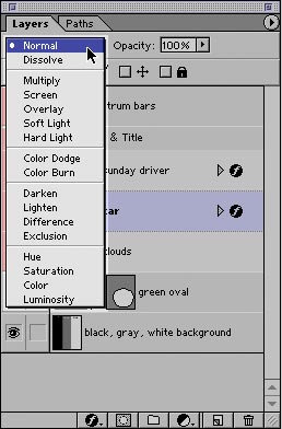
-- As far as I can see you haven't used any layer blending options, which are VITAL to making a pretty thingymajig. I don't know what version of Photoshop you have, but as far as I'm aware they all have a variety of layer blending modes. It's a scroll-down bar found on the Layers panel - in older versions, it looks like this.
-- Which leads onto my next point - EVERYTHING YOU DO GOES ON A NEW LAYER. I'm sorry if you already know this and I'm being patronizing, but this is just flat-out compulsory. Building up texture should easily take up 12-13 layers (and only a few of them should be set to 'normal' blend mode), your whole image (adjustments included) at least 20. Don't feel like these are numbers you have to aim for. The graphic should naturally build up itself.
-- The text seems a bit pixelated - did you enlarge it? Something else recommended (but not compulsory) for graphics artists is a nice selection of fonts. I downloaded a 300-font pack off dA and it's never steered me wrong (okay, maybe 300 is a bit overboard, but you get the idea XD ). NEVER use a site like CoolText or whatever that turns a lovely bit of text into an ugly blocky image D= Either download some fonts, or download some better fonts~
I'm sorry if I sounded harsh; I'm not really used to things like this All in all, though, these are very beautiful works and with a bit more practice we'll have another really talented graphics artist on our hands =D
-- Jeebus, I really need to finish that tutorial...
Anywho, ta~
I don't even like her, I just felt like making something pink and fluffy. Could've used Edgey Pearl, now I think about it...
Author:
Dawn [ Tue Sep 07, 2010 12:16 am ]
Post subject:
Re: Midnight Jasper's Graphics~
Hi Midnight. Just popping my head in here to say that your tut is AWESOME. I did some adapting to make it work with GIMP and some playing around with a bit of a clipping mask.
Here's the result:
And it nearly broke the siggy limit. Lol. I was very pleased by the result. ^^
Author:
AoN [ Tue Sep 07, 2010 10:00 am ]
Post subject:
Re: Midnight Jasper's Graphics~
Yay, another GIMP user! And that new sig is wonderful~ Not in the mood for commenting, so I'll let MJ handle it, if she has any. ;D
Author:
Midnight Jasper [ Tue Sep 07, 2010 6:19 pm ]
Post subject:
Re: Midnight Jasper's Graphics~
Thanks :3
Ooh, that's very nice. Just a small little thing - the right side of the sig looks a bit plainer, and there's a little bit of block black colour (and we don't like block colour), so I would recommend either adding some more light brushes on Overlay/Soft light or adding some more bright fractals like in the left side of the sig.
Another thing I'd recommend is trying to either blend the render into the sig a little bit more, or separate it a little bit more (confusing, right?). If you're going for making it separate, add a Stroke or something; if you're trying to blend it in, more feathering and blurring layers are good. The shadow is a very nice touch =D
Also I've seen angel_of_nature say this a lot, but borders always make things look nicer and more complete =) In Photoshop there's a Select >> Border option; not so sure about GIMP. I always make my borders 2px on Overlay.
--
Krissi~
It was hell trying to pick a colour scheme for this. You know, I made the entire thing thinking that it would be sparkly and blue, and in the end I slapped a gradient map on it and thought "Hey, this looks much better". Then of course I had to go back and change the feel of the whole thing. ARGH.
I hope it looks alright... suggestions?
Author:
Little Magician [ Wed Sep 08, 2010 5:46 am ]
Post subject:
Re: Midnight Jasper's Graphics~
angel_of_nature wrote:
Before Midnight comes and seriously critiques, here are my two cents on the sigs you made, Magician:
Spoiler: Comments
First, I'd like to say that they're very good for a start, and kudos to you for basically getting the gist of it even when it was a bit hard to follow. Still, it could be seriously improved. Here are some of the errors I noticed:
1. The Dahlia render you used was ripped a bit badly, so you could still see white dots on the outline (and even a few transparent ones inside the render) which could be solved by a stroke, as specified in Part 3 of the tut. 2. In your first sig, parts of the edges seem to have been erased, but I can't exactly help in that matter, so best to be careful when using the eraser. 3. The text should never go beyond the border that you made, since it destroys the effect. Oh, and like Midnight commented to me earlier, it would be way better if you set the text layer to Overlay, then duplicate it a few times until it's visible enough. 4. Finally, a nice touch to any sig is to add a border, so what you can do is, before putting the render, make a new layer, press Ctrl+A to select the main sig area, stroke it with white and set it to overlay.
I think that's all (at least for a non-Photoshop user), so other than those little tips, you're off to a great start!
I didn't really look closely at them afterwards, I really should of. 4. Thanks for that! I never knew to add a border. I'll try my best to make a really good one.
Midnight Jasper wrote:
lol, this is turning into a graphics crit thread XD (not that there's anything wrong with that)
Okay, first off, those Dahlia ones are very lovely, and IMO the first one looks much better than the second, so I guess you don't have to follow the tut all that closely =D
Spoiler: Comments
-- Like angel_of_nature said, your render isn't ripped too well. Find an image with a single-colour background, use the magic wand, make sure that anti-alias is ON and contiguous is OFF (this makes sure you don't accidentally select colours within the image), and delete the background. This normally nets you a lovely clean render~
-- More brushes are needed. You've done really, really well with the lovely brushes Photoshop automatically provides, but you HAVE to have custom brushes - and lots of them - to make really pretty graphics. Like I said on the tutorial, there are loads on dA and Google. Just searching "floral brushes" will return loads and loads of hits, and we all need floral brushes for our favourite Ace Attorney villainess <3
-- As far as I can see you haven't used any layer blending options, which are VITAL to making a pretty thingymajig. I don't know what version of Photoshop you have, but as far as I'm aware they all have a variety of layer blending modes. It's a scroll-down bar found on the Layers panel - in older versions, it looks like this.
-- Which leads onto my next point - EVERYTHING YOU DO GOES ON A NEW LAYER. I'm sorry if you already know this and I'm being patronizing, but this is just flat-out compulsory. Building up texture should easily take up 12-13 layers (and only a few of them should be set to 'normal' blend mode), your whole image (adjustments included) at least 20. Don't feel like these are numbers you have to aim for. The graphic should naturally build up itself.
-- The text seems a bit pixelated - did you enlarge it? Something else recommended (but not compulsory) for graphics artists is a nice selection of fonts. I downloaded a 300-font pack off dA and it's never steered me wrong (okay, maybe 300 is a bit overboard, but you get the idea XD ). NEVER use a site like CoolText or whatever that turns a lovely bit of text into an ugly blocky image D= Either download some fonts, or download some better fonts~
I'm sorry if I sounded harsh; I'm not really used to things like this All in all, though, these are very beautiful works and with a bit more practice we'll have another really talented graphics artist on our hands =D
1. I didn't realise the render had those dots! 2. I have downloaded more brushes! Thank you for telling me this. 3. That's not the version of Photoshop I have, but now I know what to look out for. Thank you! 4. I didn't know everything needed a new layer... you're not being patronizing.
Another thing; is there a graphics crit thread? That would be really helpful... And, here's a newer signature, following your tutorial. This time I tried to follow it perfectly, but the render still has dots around it. And I kinda ruined it, with the motion blur being around it. I don't know how to fix it.
Edit: The 'True Love' signature is lovely! Using Edgey would've been better. And the Kristoph signature is really nice. And I downloaded a bunch of fonts.
Author:
AoN [ Wed Sep 08, 2010 3:46 pm ]
Post subject:
Re: Midnight Jasper's Graphics~
@Dawn/Midnight: Actually, there's an easy GIMP equivalent for borders (Edit-Stroke Selection) but you have to select the image first with Ctrl+A. Oh, and the new sig is lovely~ Even if it is a bit plain, the plainness matches the feel of the whole thing. =D
@Magician: Ooh, pretty new sig! Wish I could comment, but have a lot of stuff to do, and Midnight's more experienced in Photoshop-related stuff, so I'll leave it at that. ;)
Author:
Midnight Jasper [ Wed Sep 08, 2010 4:05 pm ]
Post subject:
Re: Midnight Jasper's Graphics~
The Iris sig looks really good =D
If you've been doing everything on a new layer, then you should be able to easily erase the part of the motion blur that goes off the sig =) Same with the tiny lines further on along the sig. It's alright if the render's got dots around it on the outside like that, since you'll be wanting to blur most of the outside of your render anyway. Duplicate your render and apply a gaussian blur or something to it, then go back to the original. Select the transparent parts on that layer that aren't part of your render, then go into Select > Feather and apply a feather of about 10px. Then press delete, and the outside of the image should be blurred. This method helps blend the render into the background =)
Oh, and you could also just give it a stroke XD
Same advice I gave to angel_of_nature - text often looks better when set to Soft Light or Overlay. You may have to duplicate it a few times to make it legible.
I don't think there's a graphics crit thread... Maybe it's just me but I don't really consider making graphics an 'art'. Unless they're actually mind-blowingly amazing/creative~<3
THE LOVELY LOVELY LAYTON WEBSITE GIVES US LOTS OF LOVELY LOVELY IMAGES WITH WHICH TO MAKE LOVELY LOVELY GRAPHICAL PRETTIES YAAA~AAAY
Author:
Darth GW7 [ Wed Sep 08, 2010 4:18 pm ]
Post subject:
Re: Midnight Jasper's Graphics~
Hey Jasper, you just got the 30000th post in this subforum! Congratulations!
Author:
Midnight Jasper [ Wed Sep 08, 2010 4:24 pm ]
Post subject:
Re: Midnight Jasper's Graphics~
XD Seriously? That's epic. And I didn't even make anything... I feel kinda guilty. Maybe I should make myself something to celebrate...
Author:
Dawn [ Wed Sep 08, 2010 9:16 pm ]
Post subject:
Re: Midnight Jasper's Graphics~
angel_of_nature wrote:
@Dawn/Midnight: Actually, there's an easy GIMP equivalent for borders (Edit-Stroke Selection) but you have to select the image first with Ctrl+A. Oh, and the new sig is lovely~ Even if it is a bit plain, the plainness matches the feel of the whole thing. =D
*shocked expression*
I... did not... know that.
I use a Layer Effects plug-in which has a Stroke function, so that works, along with drop-shadow, and such.
Well, I'll oogle your graphics for a while longer if you don't mind, Midnight. They are simply delish!
Author:
feedmechocolate247 [ Thu Sep 09, 2010 1:19 am ]
Post subject:
Re: Midnight Jasper's Graphics~
Wow, your graphics are great! Absolutely one of the best I have seen on the forums! Keep it up!
Author:
AoN [ Thu Sep 09, 2010 11:00 am ]
Post subject:
Re: Midnight Jasper's Graphics~
Dawn wrote:
*shocked expression*
I... did not... know that.
I use a Layer Effects plug-in which has a Stroke function, so that works, along with drop-shadow, and such.
Ah, I see. Never was one for additional plug-ins, other than brushes and fonts. And it's not surprising that you didn't know, the only reason I learned that was because of going through a couple of GIMP sig tuts, so it's not exactly common knowledge. So...keep up the good work~ Oh, and please don't type my full username anymore, Angel's just fine. ^^;
Author:
Midnight Jasper [ Thu Sep 09, 2010 4:03 pm ]
Post subject:
Re: Midnight Jasper's Graphics~
Thanks everyone =D Sorry, Angel~ ^_^' I've got it now =D Actually, in Photoshop the Border select option is a tiny bit different from Stroke - it has a little feather on the inside, which looks very nice. I guess it doesn't make that much difference though~ (All of this translating-kinda-stuff is silly... the world would be a better place if Photoshop was free and everyone used it =D )
Things I wanna make: (yeah, other people have request lists. Not me XD ) -- Something orangey and Layton for the Lost Future -- Something pink and flowery about Byakuya. 'Cuz he's just that adorable. -- Something lovely and shippy and Fire Emblem (INNES X EIRIKA WHOO) -- Something about my wubsy Joshua and his uberawesomepic Jesusbeams
There's nothing Ace Attorney on that list XD
Author:
AoN [ Fri Sep 10, 2010 1:39 am ]
Post subject:
Re: Midnight Jasper's Graphics~
Trying to find art for an avatar to match the Shih-na sig I made, but there's a huge lack of Shih-na love, at least in fanart. Guess I'll have to stick to official art.
Author:
Midnight Jasper [ Fri Sep 10, 2010 3:57 pm ]
Post subject:
Re: Midnight Jasper's Graphics~
The avatar looks beautiful too ^_^ I would recommend blending the render in a bit more, with Blurs of some kind =D
Today at school I was contemplating crack pairings with my friends, and we noticed that if we paired together Apollo's dad with Franziska's mother, along with a few other cracky ships, basically EVERYONE is related. I'm partway into making an Ace Attorney family tree, containing as many people as possible. Nothing graphically beautiful about it; just for the lulz XD
Spoiler: everything XD
For the sake of getting all the main characters in, I have to ship Apollo/Ema, Phoenix/Iris (or Maya), Edgeworth/Kay, Franziska/Klavier, Pearl/Wocky, and Kristoph/Vera (!?). Only one relationship allowed for each person (unless their former personthingy died, like Thalassa), and I'm trying to minimalize crack pairings as much as possible. So far I've got Yatagarasu & co; all the Feys; all the Gramaryes; the von Karmas (and Pess :3); everyone from SL9; the Kitakis (lol); all the main characters (EXCEPT GUMSHOE! D=). If I get get in the Steel Samurai I'll hopefully be able to add Larry as well as everyone from 1-3 and 2-4. Christ, this is fun =D
Author:
AoN [ Sat Sep 11, 2010 1:25 am ]
Post subject:
Re: Midnight Jasper's Graphics~
Thanks for the tip, will edit that in later. :] And a family for everyone in AA? Awesome. But...isn't Gumshoe already paired with Maggey? What happened to that? Oh, and Pess is paired with what, Shoe? XD Have to go now, so....see ya!
Author:
Midnight Jasper [ Sat Sep 11, 2010 11:25 am ]
Post subject:
Re: Midnight Jasper's Graphics~
Made some stuff for papermario's awesome forum, ChannelOtaku. Thought I might as well post it here since it's been so long without some sort of graphic XD
UNWOUND FUTURE COMES OUT TOMORROW AND LAST WINDOW ON FRIDAY. HOLY SHIZEPICAWESOMENESS.
SHOE/PESS. THANK YOU =D I would totally ship Pess/Phoenix (the DOG) but they're related so it's a bit squicky... XD
The family tree is proceeding nicely, if anyone wants to see. I've got the whole Kurain and Magician thing down, sans Bikini, which is the most part. Now I need to sort out AAI and think of where to put Gumshoe (you're right, he's tied up with Maggey, who also doesn't relate to anyone... Gumshoe = Badd's adoptive son? idk...)
According to this, Neil Marshall is Magnifi's granddaughter's adopted father's lover's cousin's lover's brother's lover's sister's lover's brother.
Aren't pointless procedures fun?
I wonder if I can make this go cross-fandoms... Badd/Hyde, anyone?
Author:
AoN [ Sat Sep 11, 2010 12:40 pm ]
Post subject:
Re: Midnight Jasper's Graphics~
Ohmigawsh, that is so epic. XD And I actually followed the spoilered route. Isn't this fun or what? And yes, I approve of Badd----Gumshoe. =D But....I don't support yaoi pairings, so I don't agree with Badd/Hyde. Sorry. XD G'luck with creating the rest, then~
Spoiler: More family tree epicness (and spoilers)
So that makes Magnifi Neil's brother's lover's sister's lover's brother's lover's cousin's lover's adopted child's grandfather, right? XDDDD
And Celeste Inpax would be Valerie Hawthorne's father's lover's sister's daughter's lover's adopted child's mother's lover's sister's(?) lover's daughter's lover's cosplay's lover's RL personage's lover. This is so epic.
Author:
Midnight Jasper [ Sat Sep 11, 2010 9:02 pm ]
Post subject:
Re: Midnight Jasper's Graphics~
Glad you like it XD Srsly, how amazing are my drawings, amirite?
I don't support yaoi much either (and I totally forgot about Kyle/Rachel AND NOT MILA RACHEL WAAH). It would just be really cool to have HD in there. It's meant to be Apollo's father (who I fully intend to turn into Gant) shipped with Franziska's mother, but I totally forgot to draw a giant love heart there XD
Spoiler: Yeah well duh
Actually, I think you'll find Celeste is Valerie's father's lover's sister's daughter's lover's adopted child's mother's lover's lover's lover's daughter's lover's cosplay's lover's RL personage's lover's lover. So there XD
Also, one of my friends came up with the most brilliant link for Gumshoe: Gumshoe <3 Maggey = Viola <3 Furio = Phoenix. How genius is that? =D
Author:
AoN [ Sun Sep 12, 2010 6:15 pm ]
Post subject:
Re: Midnight Jasper's Graphics~
Oh. XD Aryt.
Spoiler: Oh....
Yeah, you got me thar. XDDD And...Maggey=Viola? o-0 When did that come up? But if you're trying to connect all of them....it could work, I guess. :rofl:
Author:
Radex [ Sun Sep 12, 2010 10:56 pm ]
Post subject:
Re: Midnight Jasper's Graphics~
Midnight Jasper wrote:
Thanks XD
C4D's are sometimes really annoying to find. It's sometimes easier to search in dA for the kinda shape you want rather than hunting through a bunch of them, like "phoenix" or "flower" or whatever. I remember once searching "Gardevoir" and coming up with a really beautiful one XD
As a fellow Photoshopper, gotta say, you're showing nice levels of improvement with each piece. Your blending with the characters and the background is getting better every time.


 Thank you for telling me this.


